/images/clemens.jpg

Hi! I'm Clemens Schotte,

Enthusiastic storyteller with a passion for technology

Azure Maps Power BI update

The Azure Maps Power BI Visual provides a rich set of data visualizations to enhance your data with location context. In the March release of Power BI, the Azure Maps visual introduces two new tools: Geocoding capabilities and a Pie Chart layer.

Geocoding in Power BI

When dealing with data that has a location context, such as addresses or other geographic information, you might lack the precise point location (latitude-longitude) needed to plot these addresses on a map. The new geocode capabilities in the Azure Maps Power BI visual allow you to convert address data into location data directly within Power BI. The Azure Maps geocoder is flexible and can work with incomplete address information or spelling mistakes. Additionally, it supports regional geocoding for various levels, including country, state or province, city, county, postal code, and partial address data.

Azure Maps Weather Services adds three new services

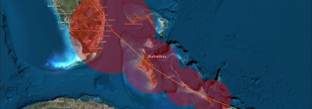
Azure Maps Weather Services, which became generally available in April 2021, has recently expanded its offerings with three new services: Historical Weather, Air Quality, and Tropical Storms. These additions empower developers and companies to enhance their capabilities when it comes to weather data.

Historical Weather

The Historical Weather API provides actuals, normals, and records climatology data by day for a specified date range, up to 31 days in a single API request. Depending on the location and feature, historical data may be available as far back as 5 to 40+ years. The information includes:

Managed Identities for Azure Maps

In many enterprise organizations, there are strict processes for privacy, access, and handling of personally identifiable information (PII). Azure Maps is a global Azure service, which means it is available worldwide (except for China and South Korea), but it also needs to store metadata and logs somewhere. In addition, Azure Maps Creator is an addon for private indoor maps that also holds map data. So, where do we keep this data?

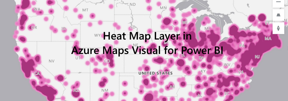
Introducing the Heat Map Layer in Azure Maps Visual for Power BI

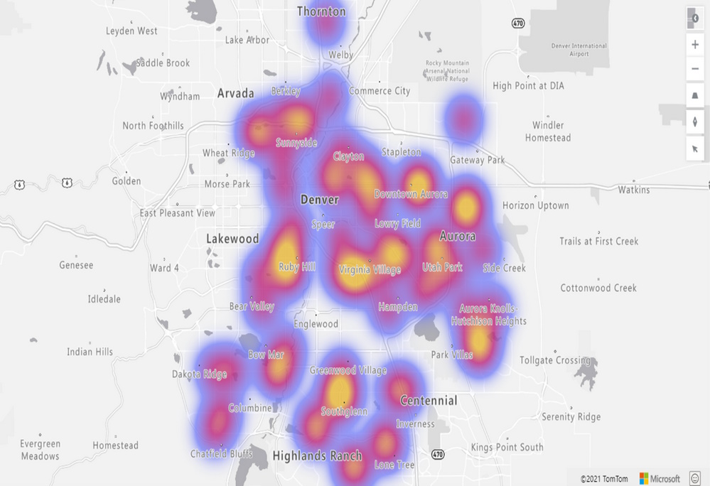
We are thrilled to announce the addition of the Heat Map layer option to the Azure Maps Visual in Power BI. This powerful feature allows you to visualize data density using various colors, highlighting data “hot spots” on a map. Whether you’re analyzing customer behavior, regional performance, or statistical trends, the heat map provides valuable insights.

Key Benefits of the Heat Map Layer in Power BI

  1. Data Density Visualization: Heat maps are ideal for rendering datasets with a large number of points. They effectively display data concentration and distribution. Use heat maps to compare customer satisfaction rates, shop performance, or any other relevant metrics across different regions or countries.
  2. Frequency Analysis: For example, by measuring the frequency with which customers visit shopping malls in various locations, you can identify popular areas and potential growth opportunities.
  3. Statistical Insights: Heat maps are excellent for visualizing vast statistical and geographical datasets. Explore patterns, correlations, and outliers with ease.
/introducing-the-heat-map-layer-in-azure-maps-visual-for-power-bi/heatmap.jpg

Customization Options

The heatmap formatting pane (Format) empowers users to tailor their visualizations according to their preferences. Here are the customization options available:

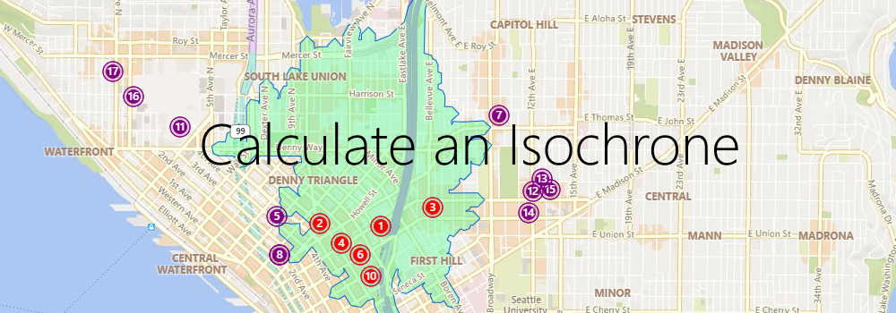
Use Azure Maps to calculate an isochrone to reach your customers

Imagine you are a store owner and would like to target customers that live within a 15-minute drive from your store with advertising for your weekly specials. You could draw a circle on a map, guessing that is about 15 minutes away, but it will not truly represent the time it will take for customers to get to your store. For example, a customer living near a major transit route can live further away from the store than a customer living in a less well-served part of the city. To meet this need, an isochrone is a polygon (an area on a map) of expected travel time. It represents the locations that will take the specified time, or less, it will take to get to a specific point (your store, in this case). Estimating an isochrone correctly, including all the variables like traffic, road, and vehicle conditions, is very hard to do by yourself!

Azure DevOps Dashboard

Introduction

When you are managing Azure DevOps in a large enterprise organization, and you are still using only one Azure DevOps organization account, you are probably hitting some limits or have potential performance issues. Microsoft’s recommendation is to have around 300 projects in a single Azure DevOps organization account. I have seen Azure DevOps organizations with more than 600 projects that still work.

The solution is to set up a multi-organization structure. Move all the inactive projects to an archive or boneyard Azure DevOps organization account and add an extra Azure DevOps organization account per department.