Power BI

Azure Maps Power BI update

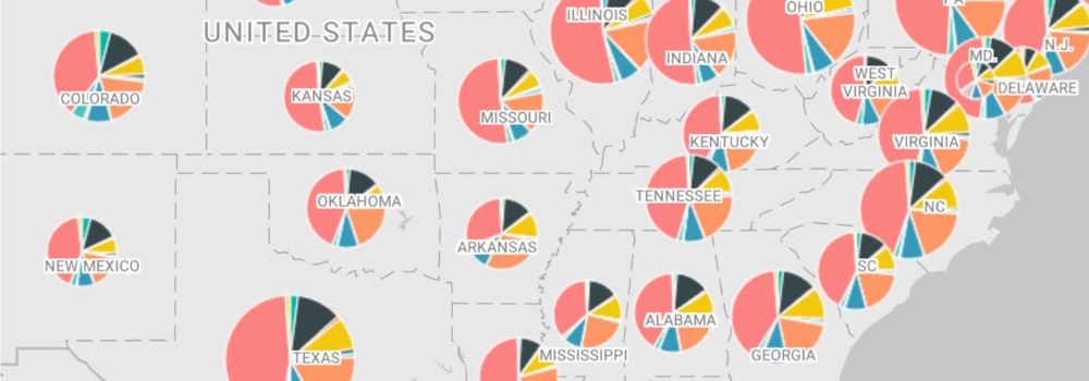
The Azure Maps Power BI Visual provides a rich set of data visualizations to enhance your data with location context. In the March release of Power BI, the Azure Maps visual introduces two new tools: Geocoding capabilities and a Pie Chart layer.

Geocoding in Power BI

When dealing with data that has a location context, such as addresses or other geographic information, you might lack the precise point location (latitude-longitude) needed to plot these addresses on a map. The new geocode capabilities in the Azure Maps Power BI visual allow you to convert address data into location data directly within Power BI. The Azure Maps geocoder is flexible and can work with incomplete address information or spelling mistakes. Additionally, it supports regional geocoding for various levels, including country, state or province, city, county, postal code, and partial address data.
Introducing the Heat Map Layer in Azure Maps Visual for Power BI

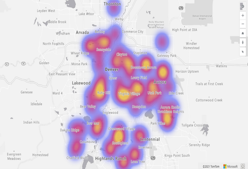
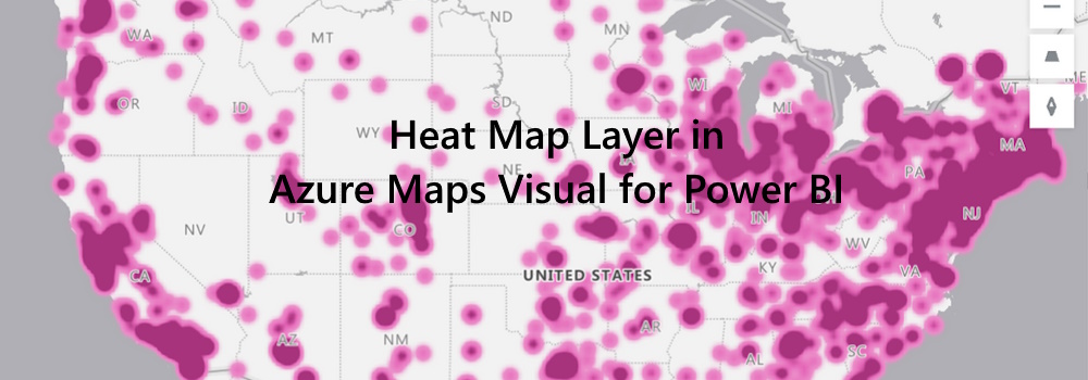
We are thrilled to announce the addition of the Heat Map layer option to the Azure Maps Visual in Power BI. This powerful feature allows you to visualize data density using various colors, highlighting data “hot spots” on a map. Whether you’re analyzing customer behavior, regional performance, or statistical trends, the heat map provides valuable insights.

Key Benefits of the Heat Map Layer in Power BI

  1. Data Density Visualization: Heat maps are ideal for rendering datasets with a large number of points. They effectively display data concentration and distribution. Use heat maps to compare customer satisfaction rates, shop performance, or any other relevant metrics across different regions or countries.
  2. Frequency Analysis: For example, by measuring the frequency with which customers visit shopping malls in various locations, you can identify popular areas and potential growth opportunities.
  3. Statistical Insights: Heat maps are excellent for visualizing vast statistical and geographical datasets. Explore patterns, correlations, and outliers with ease.
/introducing-the-heat-map-layer-in-azure-maps-visual-for-power-bi/heatmap.jpg

Customization Options

The heatmap formatting pane (Format) empowers users to tailor their visualizations according to their preferences. Here are the customization options available: